The Colors and Styles section of EliteCart allows you to fully personalize your cart's appearance to match your brand identity. This comprehensive customization panel gives you control over every visual aspect of your shopping cart experience.

Click on the color icon to open the color picker wheel, where you will also find Theme Colours we imported for you.
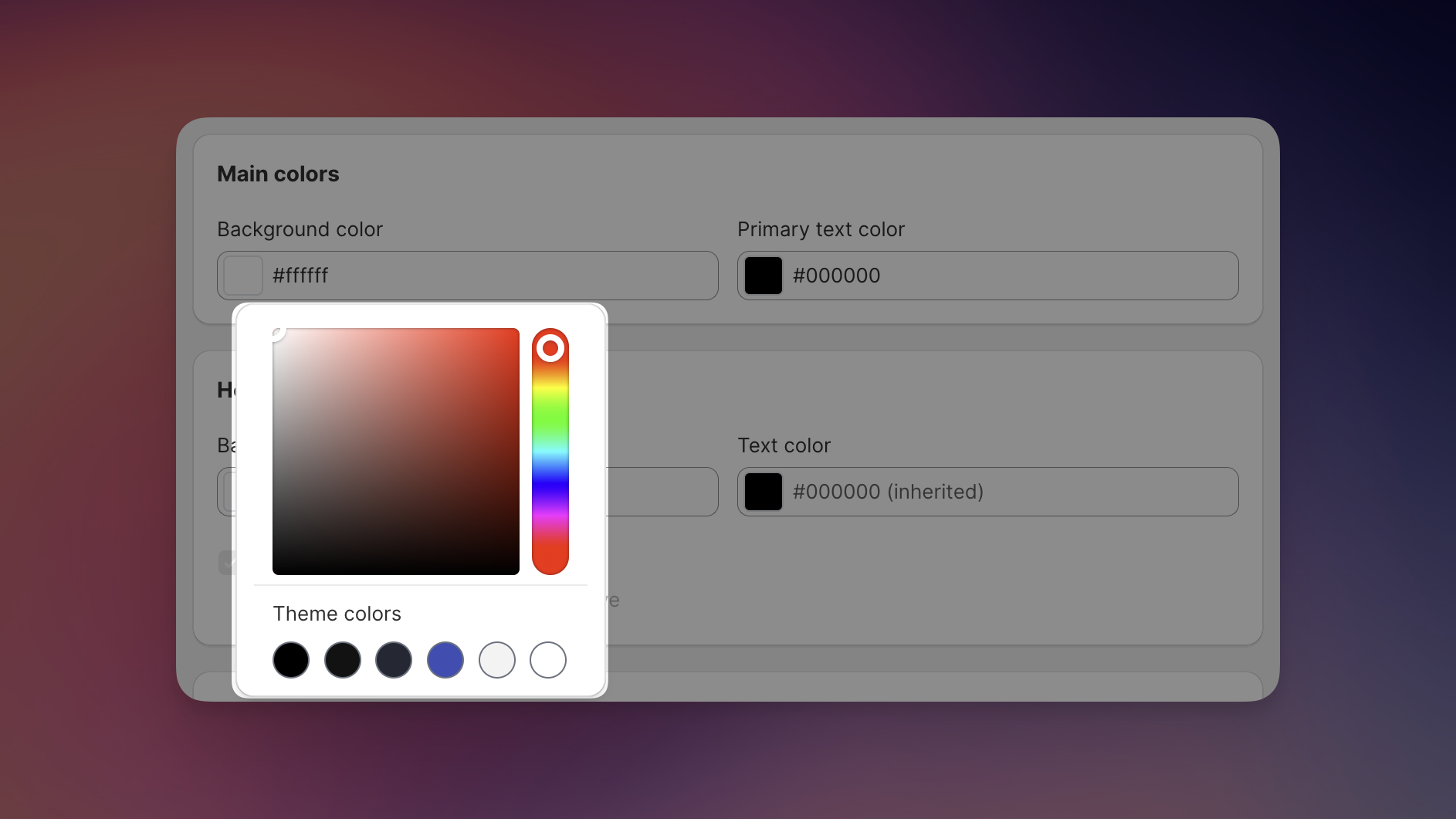
Set the primary background color for your entire cart. The default is a clean white (#f1f1f1), but you can choose any color that complements your brand.
Define the color for most text elements throughout your cart. The default is set to black (#0a0a0a) for optimal readability.
Customize the background color of your cart header. This inherits from your main background color by default but can be changed independently. As with all color fields, clicking the color icon opens the color picker with access to your theme colors for consistent branding.
Set the color for text displayed in the header section. By default, it inherits from your primary text color.
Toggle the option to hide the horizontal divider line below the header for a more seamless look.
Similar to the header, you can set a specific background color for your footer section or keep it consistent with your main background.
Customize the color of text elements in your footer section.
Choose whether to display or hide the horizontal line above your footer section.
Set the background color for your checkout button. The default is black (#0a0a0a) for a bold, clear call to action.
Customize the text color on your checkout button. The default is white (#ffffff) for maximum contrast and visibility.
Define the color used to highlight customer savings. This typically inherits from your primary text color but can be customized.
Set the color for crossed-out original prices. The default is a medium gray (#3d3d3d) to indicate the previous price.
Define the color for sale prices, typically highlighted in red (#b91c1c) to draw attention to discounts.
Toggle this option to apply rounded corners to images, buttons, and other elements for a softer look.
Toggle this setting to make all prices appear in bold text for greater emphasis.
For best performance and branding consistency, EliteCart automatically uses your theme's font and text sizes. This ensures your cart matches the rest of your store experience, though there may be slight variations between the preview and live version.
As you make changes to your cart's colors and styles, the cart designer preview will update automatically to show your selections in real-time. This allows you to experiment with different combinations until you achieve the perfect look for your brand.
For advanced styling needs beyond the standard options, you can implement custom CSS. This gives you unlimited control over every visual aspect of your cart. You can either implement custom css yourself or use our AI designer, which can generate CSS specifically for your cart.
If you need help with custom styling or have specific design requirements, don't hesitate to reach out to our support team. We're here to help you achieve the exact look you want for your EliteCart experience.
By taking advantage of these customization options, you can create a shopping cart experience that feels like a seamless extension of your store's unique visual identity.